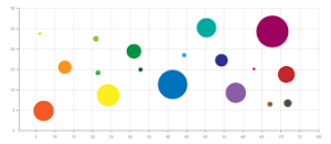
A bubble chart is a type of data visualization tool that can help businesses analyze data. The chart, also known as a bubble plot, uses bubbles to show the relationship between numeric variables. If you need to display data to account for three or more variables, a bubble chart may be the best option.
In this article, we explain what bubble charts are, how to read one, when to use a bubble chart and tips for how to create an effective bubble chart.
When to use a bubble chart
You might choose to use a bubble chart when you want to compare the relationships between different data points. For example, you could use a bubble chart to compare projects or investments to determine which are the most cost-effective, or you could compare business expenses with revenue. Since bubble charts are visual, they usually help people draw connections between data quicker than tables of statistics.
You can use a bubble chart when you have three different types of information, such as a branch location, the number of full-time employees and annual revenue. In this example, the branch location may be the bubbles, and you would plot the number of employees and revenue on the X and Y axes.
How to read a bubble chart
Bubble charts vary in how they present information, but the following steps can help you understand them:
1. Read the bubble chart’s given information
The title and labels will help you understand the given information on the bubble chart. Review the scale of the bubbles so you can get an accurate idea of the representations.
2. Compare the size of the bubbles
Bubbles of similar sizes are closely related. The largest bubbles often represent a variable’s largest result, such as the biggest population or the greatest cost, while the smallest bubbles represent the smallest result, such as the smallest population or the lowest cost.
3. Compare the location of the bubbles for bubble graphs and maps
Bubbles that sit near each other are more closely related. In bubble graphs, bubbles that lie closer to the corners tend to be more significant. For example, bubbles in the bottom-right corner of a chart could represent the most expensive, least profitable expenses, while those in the top left save the most money and produce the most revenue.
4. Compare the color of the bubbles
Colors can help differentiate between different data points in a bubble chart. Bubbles in the same color signify a close relation. If the colors in a bubble chart have any significance, they will usually come with a color legend to help you interpret them.
How to make a bubble chart in Excel
Microsoft Excel can easily transform your data into a bubble graph by following these steps:
-
Create a worksheet with the data points you want to turn into a bubble chart. Your worksheet should have at least four rows of data for the best results.
-
Select the data you want to use in your chart.
-
Click Insert in the top navigation menu.
-
Click the arrow next to the Scatter Chart icon in the Charts group.
-
Select the two-dimensional or three-dimensional bubble chart icon, depending on your preference.
-
Click on the default Chart Title and replace it with your preferred name.
-
Click to select the whole bubble chart, then click the plus icon next to it. Mark the checkbox for every element you want to include.
-
Use the Design and Format tabs to customize your bubble chart to your preferences.
Related: Top 27 Task Management Software
Tips for creating a bubble chart
Popular software programs can make creating bubble charts easy. However, it is still helpful to follow basic design principles when using these programs. The following tips can help you create clear and effective charts:
Limit your data
Charts with fewer bubbles tend to be easier to read. To ensure your bubble chart remains clear and straightforward, make sure you only include the data you need in your chart. If your chart is starting to hold too many data points, consider creating an interactive bubble chart that hides information until the reader clicks on or hovers over it.
Make bubbles the correct size
Scale the size of your bubbles to make the differences between them clear.
Use round bubbles
Round bubbles are clear and easily understood, so they are preferable to novelty shapes when creating bubble charts.
Add clear labels
Add clear labels to show what your bubbles and axes are. You could label your bubbles in a simple bubble chart by using a legend. Because bubble charts typically display three or more variables in a data point, they need clear and easily understandable labels.
Use colors and patterns effectively
Colors and patterns can help you show more information than the standard three values. For example, you could use bubbles in varying shades of red to show a country’s population density. Dark red bubbles would have the highest populations, while light red or pink bubbles would have the smallest populations. If you use different colors, you will need to use a legend to explain what each one represents.

Leave a Reply